10.28.2016

My Practice Blog

GAFE Summit


Last weekend we got to have family photos taken with our twin boys.  It was fun but also taught us a lot, like to wait a few years before the next round of family photos.


Our department at Olathe Northwest High School often produces promotional videos.  This is one of the many over the years.


11.19.2014

Drawn

Every now and then in this world of digital, I often ask myself do I still have it... ? 

It, is my talent in drawing, in painting, in...  ART?


I spent years doing Graphic Design and Computer Animation that I actually don't get to draw much...  Yes I doodle and sketch out ideas, but to actually do a full drawing is never there.  With being a teacher many of the projects I show how to do and I delete or don't save.  They are never complete and never given my full effort to create, because I am demonstrating how to use a particular tool or a particular concept.

So with the question of "Do I still have it?" in my mine, I pick up my pencil and draw.  Draw anything, I typically settle on one of the skulls in my classroom.  I have three; two deer (a spike buck and doe), and a bull. I spend maybe a total of an hour drawing with whatever I have available.  This time I had printer paper (I looked for drawing paper), a couple charcoal pencils, and a Sanguine Pastel (the redish/sienna one).  Within an hour of drawing, broken up between helping students and teaching, I feel pretty strong that I still have my talent.  


Multi-Media
1-Hour Deer Skull, Multi-Media (Graphite, Charcoal, Pastel)

Student Reaction

The fun thing I find out every time I do this is my students never believe/think that I actually can draw.  I spend so much time teaching Digital Media that they forget I have BFA in Studio Art (Computer Animation).  To get a BFA you have to have 3 drawing classes, 2 painting classes, print-making classes, sculpture classes, ceramics classes, metals/jewelry classes, a whole-lotta art history classes, with an emphasis in an area in the Studio Art realm (mine just happens to be Computer Animation.)  In other words a lot of money spent on Art...

Every now and then I have to show that drawing is an integral part and the basis of Fine Art, and also to "Get back on the Bike." 

With that being said, DRAW...  


Draw what you see, Draw what is around you, 
just DRAW.  


Learning...

Here is a lesson for my students, when I draw I break it into Flat Polygons. It is easier to concentrate on the flat plains than to draw the whole. I look at it like I am going to create it in 3D, small sections at a time. Break it all into the simplest form.  When I have it broken into Polygons, I think of which way is that Polygon facing and what is the best way to show it facing up/left/right? How does it connect to the next one? I always think how each part fits together. 

If I can create it in a 3D world, I sure can draw it.


10.16.2014

Royals Rocked!!!


Had this idea for a couple weeks and actually designed it today.  For the Royals ALCS Win...  

We are heading to the World Series!!!

5.01.2014

Summer Animation Project

SummerAssignment

The Animation Summer Assignment created for those students entering into the e-Communication Program post Freshman year.  This assignment is learning the basics of 3D modeling and working within the 3D environment.  Although this isn't all what animation is about it is a large part of the e-Communication Animation class.

With SketchupMake you learn the basics of 3D Modeling that is needed for Sophomore year. This program is recommended for primary and secondary education. Free use for any educational purpose, on PC and Mac Platform.  

The summer animation assignment is broken into various stages.
  • Watching the Learning Sketchup Videos.
  • Practicing with the program.
  • Modeling in Sketchup.

Please download the free version of SketchupMake here.

 LearningSketchup

Watch the two attached videos.  These videos will demonstrate the basics of Sketchup.  They will introduce you to the navigation tools so you can orbit, pan and zoom around your model, then create a simple house with a few drawing and modification tools.  
Pay particular attention to the inferencing to points and lines.  This will help you be a good modeler and animator later.
The second video will accelerate your process by creating a more detailed house with some drawing tips and the follow-me and offset tools.  The Offset tool is a great tool to use while making window and door frames.  If you wish to watch more learning videos, click here.

PracticingSketchup

The first part of the Assignment is to download three Self-Paced Lessons that teaches the basics of Sketchup.
Click each tab and follow along with the Self-Paced Lesson.  When done Save and these will be turned in with the final project.
The second part of the assignment is to…

ModelingSketchup

The assignment portion of Sketchup is to create a "Dream" House…  this model is to detailed as possible.  The more realistic the better.  Don't worry you will not be modeling the interior of the house; no furniture, toilets, or pets...

Go to the following Site: http://www.houseplans.com
  • Select only a 1 story house. 
  • 2 Bedroom
  • 1 Bath
  • No or 1 Car Garage
  • Must have a ROOF, no flat roofs
Find a house plan that you like.  You will be modeling this home in Sketchup… be careful to look at the complexity of the home.  Basic is fine, you will have the chance to modify later
Save all images that are available.
  • Floor Plan
  • Front View
  • Any other view..
Place images into a Blog, and include the URL of the house you choose.
Example Images:
Make sure the floor plan has
the outside dimensions,
unlike this image...

HouseRequirements
    • Only the exterior needs to be modeled.
      • Start with the square, only paying attention to the outside dimensions.
      • Height is typically 10’ before getting to the roof.
      • Attention to detail is critical.
      • The Sketchup Learning Videos will overview how and what needs to be made.  


      • Include: Windows, Doors, and Chimney.  
      • Add elaborations, window panes, siding, brickwork.
    • All surface polygons need to be textured with the paint bucket no flat colors.
    • Realism is key  
Some additional changes are good, don’t go over board.

Complete:

  1. Starting a Drawing (part 1-3) completed files.
  2. SketchupHouse Modeled
    • Render out 5-6 views of your house.
      • File/Export/2D graphic
    • Also save the house as Dreamhome.skp
  3. Email all parts to Mr. Netterville.
Turn in steps
  1. Create a Post on your Blog.
    • Import the house.com images of your house.
      • Including the url of the house you used to model.
    • In Sketchup
      • View/Animation/Add Scene
        • Add 5-6 different views of around your house.
      • Go to File/Export/Animation
        • Export as compressed with h.264 (.mp4)
    • Import Sketchup Movie into the Blog.
    • Under your Movie write a few sentences about the highlights of using sketchup and your Animation Assignment for the summer.
  2. Link back to eComm Summer Assignment

All lesson files & video were developed by Google Sketchup, lesson created by Mr. Netterville.

4.21.2014

Playtime!

Sometimes I make assignments for the students or friends talk about things that give rise to a various degrees of play…  Well play for me…

I call it flushing the mind where I have to design it or do it to get it out of my mind.  These won't really be my best work, or me cleanest designs, but just mind vomit...

I will post them here, when I do them I will post them…

Parody Flakes!


This one was from an assignment that my students had to create a parody cereal that they then surfaced a 3D box with it.  I spent about 10 - 20 minutes on it before my next class.  Then I never returned to it…  I would still do a lot to it and clean up a lot, but don't have time.  Maybe next year when I need an example piece.

But until then this will sit and wait…

Mundane Ad!


In my graphic design class I give an Assignments to "Design for the Mundane"  they have to appeal to a target audience.  The target audience came from one of their classmates that had to fill out a survey.   The survey contained questions like, What is your dream vacation?, What is your favorite color?, Do you like circles or squares better (curves or angles)?

They passed in the survey and were shuffled.  The sheet they got back was their target audience they and had to appeal to that person, and sell them the item listed on the back.  Example: Cardboard box, a rock, rope, stick…

This was an example of one that I created…  Vacation: Mexico (Spanish)
Color: Red
Circle or Square: Square

There were other questions that it asked… But I forgot what they where for this one.  I think it had a motorcycle racer as a hobby?

Tattoo-agram!


In my many years I have often been asked if I could get a Tattoo what would it be?  To state right now…  I don't have a tattoo, I could never decide on one.  Everytime I designed one it would change a week later, thus deciding that I would never be satisfied if I actually got one.

A few years ago, I designed this one.  It was based off the "Da Vinci Code" Where it had Ambigrams, one way it said one thing and the other said something totally different.  If you lay it down it one way it would read my initials, the other would read my wife's initials.  (ASN/CMN)

I bet everyone is now tilting their heads to see it.

But this has been long forgotten into my folders of design.


Testing - 1, 2, 3???

Many times I get to do tutorials and test out new things in After Effects or Maya, I am just trying to teach myself something that I can bring back to my students.  I found Lynda.com and Video Copilot a few fun places to go...


2.19.2014

Designing the TEN


Being a part of e-Communication Department you are often asked to lend a creative hand, as teachers and as students.  For students we call it Endorsement Hours, where ours e-Communication Students do two years of 50 hours of work in an e-Communication field.  Logos, PSAs, Website Design… Whatever they can do as long as it is related to the industry that we teach them in class.

As teachers we do it for fun…  A chance to show that we can do something other than just teach.  I like to say bragging rights.  Also, it keeps us as teachers "practicing what we preach."  Last year I go to do a couple logos that I am proud of…  

To those students that know me after 2012, I love doing graphic design. I know that I always say Graphic Design is boring, and anybody can make a flat image.  It is because I am jealous and that loved teaching it.  Ask any of the Graphic Design students that graduated 2013 or prior.


The first logos…  I got stuck on an idea.
Sometimes you just need to scrap an idea and start fresh.
But one common theme of pointing to the Northwest with 10.

The ONW Ten Year:  


A logo celebrating 10 years of ONW being open.  When I was teaching Graphic Design I was approached to do a logo for this by Dr. Poss, ONW Principal.  I did multiple drawing and sketches as well as work on the computer.  I will have to find my original sketch of the "X" with the arrow pointing to the Northwest.  I do have it, just put it somewhere safe.  Safe means I will find it when I am designing the 20th anniversary logo.  


I scrapped all the previous ideas, and started sketching...
After doing a few sketches I settled in on the "X"
The X, Roman Numeral for 10, as you can see I worked through a few ideas prior to actually settling on the "X"  The other problem was getting the "X" to look right.  A normal "X" didn't seem to work, especially trying to make one side point.  So I used an "I," actually two.  One I attached an arrow to the top, and then used perspective and shear to get it to have the 3D look… Going bock into space.  Although the "X" is very simple there is a lot of though put into it.  

There are reasons for the font, the barbs under the arrow, the shield, everything that you do for a logo there must be a reason and understand those reasons.  

The font, yes it is actually Times New Roman, modified…  I figured Roman Numeral, Times New Roman… There is always stability and a sense of being classic in Times.  Thus, ONW being open for 10 years.  I say modified because it is sheared, stretched, and I changed the Serif on it quite a bit.  The Times font was more of a guide by the time I got done with it.


ONW Compass
The Barbs on the compass arrow pointing to the NW, I used them mainly for a visual stop.  If not the Arrow will take the viewers eye off the logo and towards the upper left side.  It is also looking at the original ONW Compass logo an mimicking the parts of that logo and tying them together.  In actual use the barbs on an arrow is to ensure that the arrow sticks to whatever it is shot/stuck into and doesn't come out...

The Shield, of course in typical meaning is protect, but it is in a "Coat of Arms."  Basically, I needed something for the "X" to sit on or it would have too mush negative space around it.  In Heraldry, the art of creating Coats of Arms,  a blue/azure shield means loyalty which goes with being the 10th Anniversary of ONW.  The shield was also gaining momentum in logos over the past few years.  In schools, it is often used just a typical depiction of the Crest.  Roman Numeral, Times New Roman, Arrows with Barbs, Shields Starting to see a theme?


Flat logo without being Embossed or Gradients.
Actually used for the Embroidery Logo.
Embossed, I have always been a fan of creating a little depth to my designs.  To make it appear that it comes out to the viewer.  Flat design is just that, FLAT, to grab a viewers attention should be the goal of any design.  To make your viewer stop and take a journey through a design, to lead their eye to what you want them to see, to spend a little time gazing upon the glory that is your ART!  


Come look at my glorious artwork…  ok, now go away… 

Top Left: Logo with ONW Mission Statement, shield solid blue.
Top Right: Logo with Olathe Northwest in 
                     Highway Font, shield split blue
Bottom: Logo with Bank Gothic, shield border shadow

Now with every logo I create I make many variations, now many is probably around the lines of 10-15 different ones to get settled into the final…

I will show them all on one sheet for you to see.  You might not see the exact changes but the are there… Scooting things around test out different looks.  One of the first actually had the ONW Mission Statement around the border of the shield.  Settling in on using the Raven head logo for the final one…  and still working out the sizes.

During this entire time I was in constant contact with Jay Novachek, ONW Athletic Director/Assistant Principal.  Bouncing all these ideas off of him…  I have to give some credit to him, although he didn't design it he was a critical part of the design process as I worked. 

But as you see, an outline appeared on the outside of the Raven Head.  Basically look at it with out the white outline, above, and with it, below. This logo appeared on a multitude of items from Letterheads to Banners.  When it was small the Raven Head disappeared and didn't POP enough so it appeared.  The same reason why I put a gradient on the beak…  to make the teeth of the raven POP!  

The OLATHE NORTHWEST font is Bank Gothic, no explanation, I like the font.  I can say that the Goths were always at war with the Romans… now I am just showing off with history knowledge.  Simply the font went well with the design.  I did click through a lot of the fonts, and it was a best monospaced san-serif font that I happened to like, that fit well in the space provided.

The rest of the logo is Highway Gothic font.  So, yes, it is the font that is used on all the highway signs.  I bet you didn't know that…  You can see it in the numbers mainly.  I used the same font on the STN shirts that year.  We road tripped to Dallas, and I recreated the I-35 sign on the back.  Had the font might as well use it.

So this is the design process of ONW's Tenth Anniversary logo...


2.12.2014

Blast from the past: A Netterville Original

Story Boards of Final Project:

I was going through all the files that I have, and found the storyboards that once were posted for my final project…  This is the beginning of a three piece Animation:  "Curisity," "Loss and Understanding," and "Finding our Way."  Back in the day my thoughts on this one was:  With curiosity you often will get lost into a world that you are very unsure of.  Thus the dragon fly that distracts the young curious dino-creature, and leads it off to a place that is unknown to the young animal.


It gets further and further away...


And still further...


Until the Dragonfly flies off and the animal and viewers lose it when it lines up with the sun.  This is where the young animal cannot follow and discovers that it is in the middle of the desert.


Modeling & Animating Phase:  

Here are a couple models of my animation, this is before I started surfacing all the models.  And also a walk cycle with all the texturing applies to it…  Doing a 4 legged walk cycle was huge and very difficult.  I went to the Kansas City Zoo and watched the elephants walk, which was difficult because during hot summers they don't really like to walk around too much.
Research:

I actually went and watched elephants walk at the zoo because I wanted more of a lumbering walk, from a large land animal.


Test Renders:


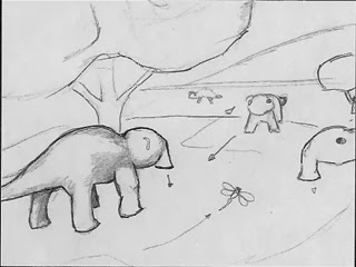
The herd of Animals…

These creatures were Hybrids that I make off of two different previous models.
Head of a Mouse and a body of a dinosaur… 


I wanted to make the older ones larger, but also have a slightly different look to them.  Also the walk cycle that I modeled them off of… was…  yes, you guessed it the ELEPHANT.  Slow Lumbering walk…

Right before he is left in the middle of the desert...

Hope you enjoyed this Throw-Back of Mr. Netterville's Projects…  

The only Original Digital Version of my animations are on archaic media that is locked away until a ZIP Drive can be found.  I ripped this from my Senior Project DVD and is at a very low resolution, but it works!


The music is from the Count of Monte Christo soundtrack...